 Girl's Behavior
  Guy's Behavior
  Flirting
  Dating
  Relationships
  Fashion & Beauty
  Health & Fitness
  Marriage & Weddings
  Shopping & Gifts
  Technology & Internet
  Break Up & Divorce
  Education & Career
  Entertainment & Arts
  Family & Friends
  Food & Beverage
  Hobbies & Leisure
  Other
Other  Religion & Spirituality
  Society & Politics
  Sports
  Travel
  Trending & News
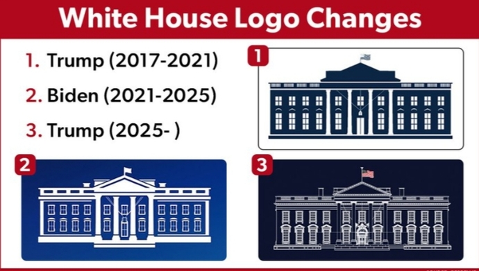
Do you like the new White House logo, with its intricate details, compared to past logos?
How does it compare to Trump's and Biden's previous logos?
Updates
1 y
TBH, I don't like the new logo. It's too dark. My preference would be to take Trump's old logo and add a large color US flag on top.


Most Helpful Opinions