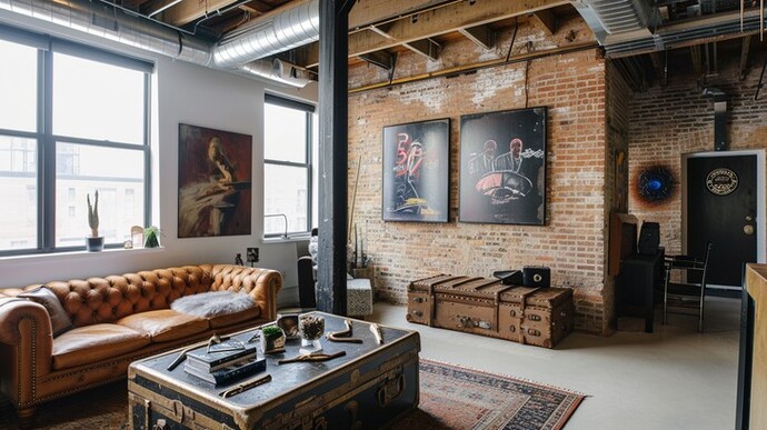
What are your thoughts on this apartment?

Girl's Behavior
Guy's Behavior
Flirting
Dating
Relationships
Fashion & Beauty
Health & Fitness
Marriage & Weddings
Shopping & Gifts
Technology & Internet
Break Up & Divorce
Education & Career
Entertainment & Arts
Family & Friends
Food & Beverage
Hobbies & Leisure
Other
Religion & Spirituality
Society & Politics
Sports
Travel
Trending & News 
Interiour Design Assessment.
The ‘theme’ appears to be ’Living on a Tight Budget, but with Effort’.
Which does not necessarily mean that all items are ‘cheap’.
Room, structural: The raw brick walls place an interesting contrast to the finished white walls. They may appear ‘neglected’ but as long as they are kept dirt free they deserve to be there.
Flooring: its plainness continues the wall appearance, but with a colour slightly offset. These two light coloured surfaces prevent the room from feeling dark.
Ceiling: Here some additional effort can be invested - visible HVAC ducts can be a styling element, but in the present case -together with other installations- the arrangement looks ’unplanned’ (design-wise).
The pillar in the room gives an unnecessary contrast and could be painted in a colour that corresponds with the bricks or the ceiling beams.
Decorative elements: The main furniture lead the overall impression. Their style is close enough to suggest ‘continuity’. The chair behind the pillar is an insult and should be thrown away. A few cluttered additional furniture pieces suggest that the appartment has insufficient storage space. Basic impression: collectors items (I mean that as kind of a compliment). The pictures on the wall attempt the same, but fail. It would be better to remove the one between the windows, and to reduce the size of the two on the brick wall. That sign thing on the door looks like a remainder of the earlier tennant - it does not integrate. The colour patch next to it generally fits, but could have a backing plate.
Single decoration articles: The ’couch trunk’ looks overloaded. Some of this stuff could be displayed between the windows on a shelf where the picture had been. The plant on the window sill (if it was one once) should either follow that chair, or get some plant companions. The carpet looks worn; a pity, because in a better condition it would have looked quite right.
The windows need attention: they look ’naked’ and intrusive opposed to being a part of the room. Curtains would topple the room balance, so one could thing of ‘venetian blinds’ or vertical sunshades - probably mounted outside.
Lighting is not seen. But I would expect that indirect lighting (i. e. behind the pictures, under the couch) with a few spot downlights will add positive accents.
Thanks, mate :)
it has a real retro flavor to it.
Opinion
14Opinion
Coach, where in the hell have you been?
This looks like an apartment from a set for a movie, not a real apartment. Looks like it would be cold and drafty.
Ha GAG vacation... what's happening
I'll DM you.
Hideous, the only good thing is that cool trunk. It's apartment that says shut up, you don't matter, sit in storage and eat your porridge until it's time for work.
lmao.
Still there's a nice beam to hang yourself from, doubt you'll be the first.
Nice beam nice trunk I think you are warming up to this place
Nice looking. I don’t think I love the look of the whole “industrial renovation” for myself. It’s not really my vibe, personally. Brick walls indoors…. not my speed.
That said, if it IS your speed, and you don’t give a fuck about what WhiteSteve from the internet thinks about it, as no one should, lmao…. I think it’s well done and a nice spot for the right person.
It looks like whosever did the plastering ran out of money halfway through. There doesn't appear to be a working heating/HVAC system, the windows are single glazed and there's no carpet. I wouldn't get much rental from it.
Simples...
Looks like a nicely appointed big city apartment. Great big windows interesting brick wall... Would like to see the kitchen and bedroom (s) and bathroom.
would need at least... three different inspections passed before I look at any other details, lol
A good set-up though i would ALWAYS be tempted to fix the wall so the bricks look more identical... Sigh.
It needs some window treatments because it's so bright. 😎
I like that it's nice and clean.
It looks like a great man cave. 🙂
Looks like an old converted warehouse. Everything is brown and gray, makes it depressing. Needs some color to make it inviting.
I like it but it looks a little bit on the small side. Where is it and how much it per month is it?
Toronto around 3700 UDD lol
Super cool. Big fan of loft / industrial spaces
Looks like it would be expensive to both heat or cool. 🥵🥶
Not a fan of industrial designs. Looks more like a converted warehouse than a cozy home.
Yeah, it's a loft. They inserted several ceilings to divide the high vertical into apartments.
Looks decent but no roof insulation, no blinds or curtains and probably in the city.
Looks like an old reinforced masonry building. Like maybe an old warehouse that was converted into a downtown loft. Not my type of dwelling. I'm not knocking on it. Just not my thing.
If that’s the top floor, that uninsulated open ceiling looks like a nightmare during summer days
I don’t like the beam or the lack of traditional ceiling. The brick is nice but it gives a warehouse vibe because of the ceiling.
@coachTanthony My idea of MY Perfect Man CAVE!!!
Cool, where have you been coach? Long time no see!
GAG vacation lol
😁👍🏻
I like the rustic look, it's nice.
AI Generated
That's a loft, not an apartment
Decent little crib.
Its sweet!
You can also add your opinion below!
Most Helpful Opinions