 Girl's Behavior
  Guy's Behavior
  Flirting
  Dating
  Relationships
  Fashion & Beauty
  Health & Fitness
  Marriage & Weddings
  Shopping & Gifts
  Technology & Internet
  Break Up & Divorce
  Education & Career
  Entertainment & Arts
  Family & Friends
  Food & Beverage
  Hobbies & Leisure
  Other
Other  Religion & Spirituality
  Society & Politics
  Sports
  Travel
  Trending & News
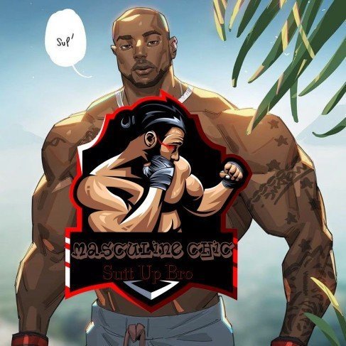
 Remember in my question that I mentioned yesterday about hoping to start a business I am trying to find the idea logo, I generally wondering in your eyes which logo I made looks the best to you? And yes I made all the these logos, there is logo making apps you can search up and they free too. by the way I have asked my mom which logos are her favorite but I am still a bit lost because there are so many cool logo designs I can make.

This Logo

This Logo

This Logo

This Logo

This Logo

This Logo
Select gender and age to cast your vote:

Most Helpful Opinions