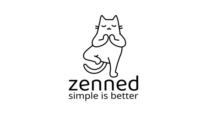
This

That
Select gender and age to cast your vote:
 Girl's Behavior
  Guy's Behavior
  Flirting
  Dating
  Relationships
  Fashion & Beauty
  Health & Fitness
  Marriage & Weddings
  Shopping & Gifts
  Technology & Internet
  Break Up & Divorce
  Education & Career
  Entertainment & Arts
  Family & Friends
  Food & Beverage
  Hobbies & Leisure
  Other
Other  Religion & Spirituality
  Society & Politics
  Sports
  Travel
  Trending & News









You can also add your opinion below!

What Girls & Guys Said
Opinion
1Opinion
I liked ‘this’ because it seemed more geometrical, than open and squiggly/thin, to the point you can’t really see it (it being the whole image).
It seems thicker/fuller enough to see, and it seems balanced in its shape. It’s more pleasing to the eye, and calming for me, which- considering the name and the pose of the cat- seems like the wiser option, if there was one. ☝️
The cat itself, seems to be standing on a “box of words.” It seems balanced and somewhat, subconsciously/logically grounded, instead of free-floating. (If that makes any sense).
It was an easy decision for me, 👐 but they’re both artistic, and can be liked for various reasons. I hope the creator finds the suiting image for their brand/merchandise.
Fun and engaging question. 😁
Thanks for the points 👌😉
The first one because it has a slogan.
I like this answer. You pretty much gave the right marketing strategy/ moral goal, of the owner to have, for their logo.
Didn’t go into much detail, but gave the exact reason, and I appreciate that. 🙌
Actually i'm surprised that i wrote that comment while i were about to sleep and couldn't see what's in front of me 😅, when i saw the logo again and i forgot to mention that if this logo is for a mobile app i won't choose any of them because in mobile apps you have to remove any text to make sure your logo sharpe and clear as mich as you can so the icon will look good, but in app you can use the first logo with the slogan, showing the slogan in logos for new brands is a good move and many companies did it in their beginnings, and then they removed it when they become too known and humongous, but the slogan will give a nostalgic feeling and make it more familiar and it will represent the brand with tne name.
I read you comment and i totally agree with your opinion and i appreciate it too. 🙏🏻
Not a mobile app ;)
@es20490446e
I liked the slogan, simple and has few words as possible, good choice 💪🏻
Thanks!