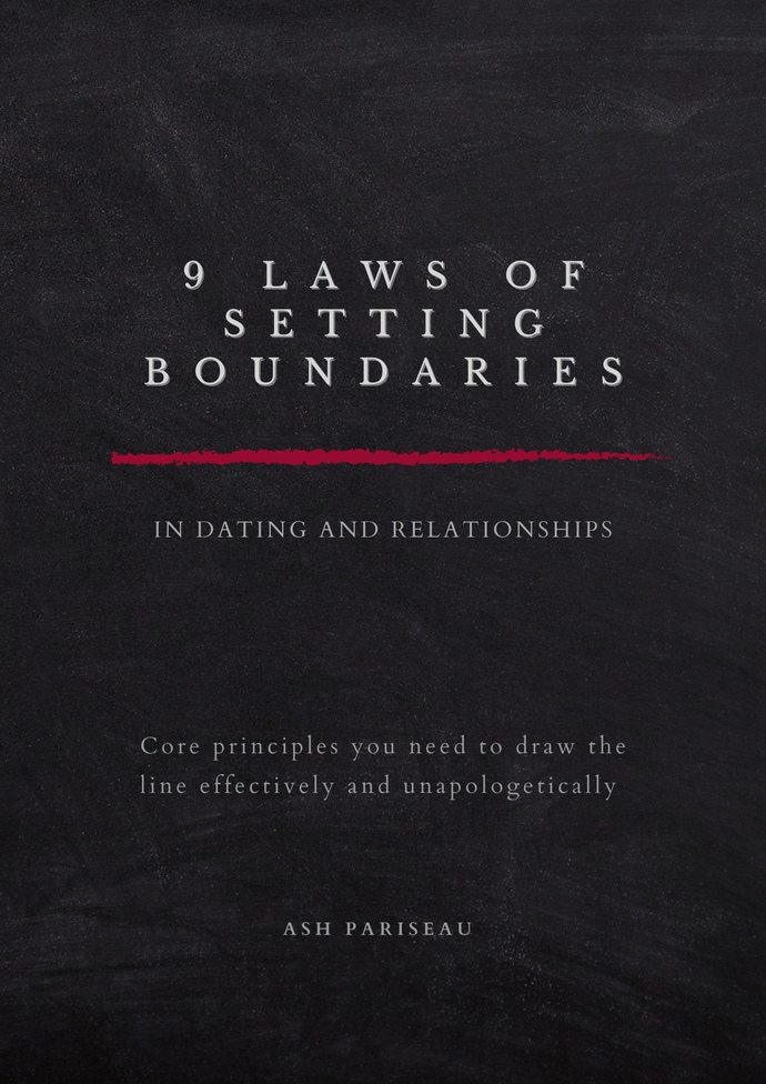
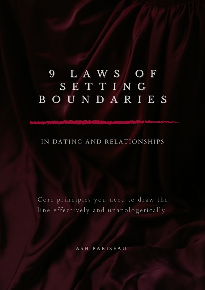
I’m working on a gratis e-book for my mailing list and I’m trying to have it done by next Monday. I might use both of these cover interchangeably but I’m curious which background lands with more people.
Red, because it makes a more dramatic appearance, and a dramatic appearance is what grabs a book's attention from readers. Honestly, books that look dramatic or have bold or colorful pictures are what grab a person's attention because people love to see things that would make them use their imagination.

 Girl's Behavior
  Guy's Behavior
  Flirting
  Dating
  Relationships
  Fashion & Beauty
  Health & Fitness
  Marriage & Weddings
  Shopping & Gifts
  Technology & Internet
  Break Up & Divorce
  Education & Career
  Entertainment & Arts
  Family & Friends
  Food & Beverage
  Hobbies & Leisure
  Other
Other  Religion & Spirituality
  Society & Politics
  Sports
  Travel
  Trending & News