 Girl's Behavior
  Guy's Behavior
  Flirting
  Dating
  Relationships
  Fashion & Beauty
  Health & Fitness
  Marriage & Weddings
  Shopping & Gifts
  Technology & Internet
  Break Up & Divorce
  Education & Career
  Entertainment & Arts
  Family & Friends
  Food & Beverage
  Hobbies & Leisure
  Other
Other  Religion & Spirituality
  Society & Politics
  Sports
  Travel
  Trending & News

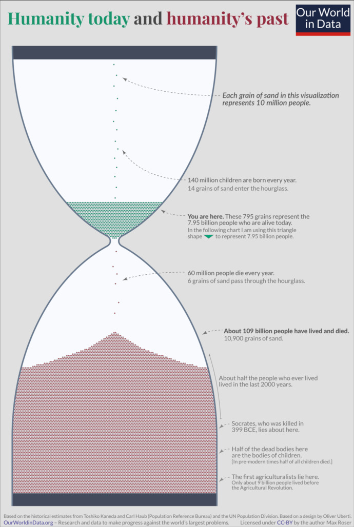
This illustration shows how world population has changed over time. The blue grains of sand at in the top section of the hourglass show the approximately 8 billion people alive today, while the red grains in the bottom section show the approximately 109 billion people who have died during human history.
What do you think of this?
Image by Max Roser - https://ourworldindata.org/longtermism, CC BY 4.0, https://commons.wikimedia.org/w/index.php?curid=116153998



























Most Helpful Opinions