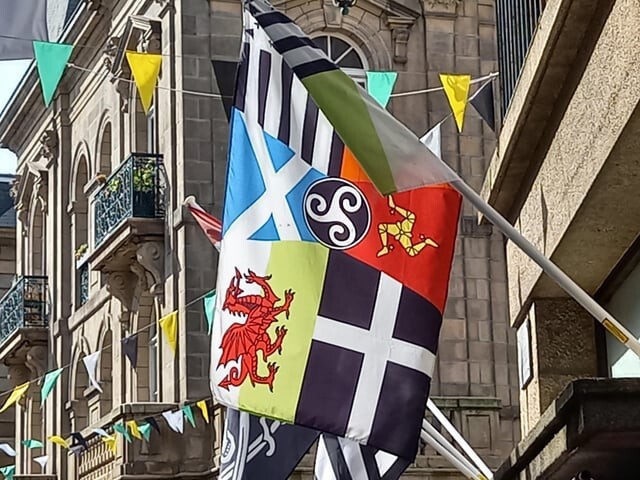
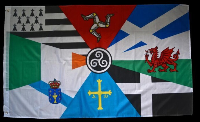
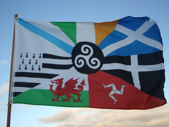
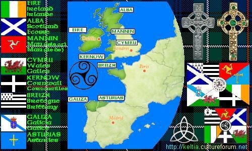
A good flag should be near impossible for children to draw, and non fits the bill better than the Celtic nations flag. For a start some flags represent 8 countries, others only 6. Then they never put the 'pieces' in the same order.
But it's a common site across the Celtic world. Some say it's inclusive and unifying, others say a kaleidoscopic monstrosity.
Personally I like the concept but think it needs refining.
Looks like something kids would stick in a sand castle
The middle symbol is a triskelion. It represents things that come in 3s. Eg birth-life-death, or the father-son-holy ghost. Over the centuries it's taken on different meanings to different people.
Yikes! Umm, …. I’m not exactly feeling that one. That’s a lot going on there. It’s just too literal, too busy, and kind of a cluster fuck. There should be a world-wide contest or something, for young vexillologists to come up with something much simpler, more tasteful, but representative of those nations.
1: Keep It Simple. The flag should be so simple that a child can draw it from memory.
Complex shapes, crests, small details, complicated layout of designs and colors. Its a complete mess and I would struggle to remember it unless I actually studied it very specifically.
2: Use Meaningful Symbolism. The flag's images, colors, or patterns should relate to what it symbolizes.
While this tries to include as many references and homages as possible, I think it goes too far. Less is usually more and the point is to boil it down to something that they have all in common rather than try to include everyone in their own personal corner.
3: Use 2 or 3 Basic Colors. Limit the number of colors on the flag to three which contrast well and come from the standard color set.
Yeah.. So that ship has sailed. Furthermore, the fact that it includes several different shades of the same color such as blue is already alarming. A good flag should use basic colors that one might reasonably find in for example a kids box of crayons and not indulge in countless shades just because you can.
4: No Lettering or Seals. Never use writing of any kind or an organization's seal.
Some versions of that flag has lettering or perhaps its runes? Either way, bad design.
5: Be Distinctive or Be Related. Avoid duplicating other flags, but use similarities to show connections.
This flag is far too chaotic to be distinctive. The fact that every picture you showed is significantly different from the next in the layout and design is good proof of how little it actually means. You could move around the different elements and nobody would bat an eye but if you moved the elements around on a well designed flag then it would be noticeable and feel wrong.
I like it, but why are the Celtic areas of Spain missing on some of the flags?
And it really should be standardized, with pieces always in the same place. Otherwise, how would you know to display it upside down in times of trouble?
purplepoppy I voted B, let's face it purple poppy aka ceri, aka witch lady in a good way you know you know - magic 😜✨ - let's face it, existing flags are superior - the only time a flag sucks is when the star ⭐ isn't a star ✨⭐
@OneViewpoint D**n right, and "Chief" will be 72 next Saturday, Aug.30.(He was underrated because he's black in a racist city with two white fellow Hall Of Fame teammates !!!)
With Parrish it was the little things that impressed me. Big men have a hard time staying healthy. I can't remember Parrish ever missing any games because of injury. He did martial arts and yoga. He was always ready to go. The guy was stoic. No temper tantrums or anger. No stupid behavior off the court. He was never out of position. He played in the paint when it was still brutal to play in the paint. And the Celtics used the hell out their low post game with their big 3, Bird, McHale, and Parrish being directed by DJ. Ainge was a whiny little pain in the ass. Parrish was just a consummate teammate and professional. Didn't seem to care about personal stats more than winning. And the Celtics won a LOT with Parrish at center.
@OneViewpoint Parish DID beat up Pistons pr*ck Bill Laimbeer, but his "Chief" nickname came from his usual stoicism. Robbie is about two months younger than I !!!
Lain beer was an asshole. Couldn’t play for shit so he relied on cheap shot and fouls.
And yeah Boston was racist as hell. Boston cops were basically Irish mob. I grew up there during jr high and high school.
I was crossing city plaza one day with friends. There was some event going on. We walked over. Turns out the city of Boston had given the Klan, yeah the Klan, a permit to have a rally. But the crowd was mostly protestors. I guess the cops didn’t like that. They used mounted police on horses to break up the crowd. They were just riding in and cracking random people with batons. WTF. Didn’t go near the Klan guys giving their hate speech though.
Some old Italian lady was just walking through the plaza with her 2 sons. On the outskirts of the crowd. It was obvious they were just passing through to go shopping or whatever. A cop on foot whacked the oldest kid in the head and he went down. The mother tried to use her body to shield her kid and the cop started wailing away on her. The youngest kid was screaming and crying.
@OneViewpoint Laimbeer COULD play (he was the NBA's rebound leader in 1984-1985 and average about 13 points and 9.7 rebounds a season), but resorted to cheap shots to compensate for his relative lack of otherworldly athleticism. (At six-eleven,260, Laimbeer wasn't muscular or strong;he was earthbound and ran like a pregnant hippo, but positioned himself well under the glass for boards, had an excellent 15-18-foot tiptoe "jumper," and was an underrated team defender despite his slowness.
 Girl's Behavior
  Guy's Behavior
  Flirting
  Dating
  Relationships
  Fashion & Beauty
  Health & Fitness
  Marriage & Weddings
  Shopping & Gifts
  Technology & Internet
  Break Up & Divorce
  Education & Career
  Entertainment & Arts
  Family & Friends
  Food & Beverage
  Hobbies & Leisure
  Other
Other  Religion & Spirituality
  Society & Politics
  Sports
  Travel
  Trending & News