 Girl's Behavior
  Guy's Behavior
  Flirting
  Dating
  Relationships
  Fashion & Beauty
  Health & Fitness
  Marriage & Weddings
  Shopping & Gifts
  Technology & Internet
  Break Up & Divorce
  Education & Career
  Entertainment & Arts
  Family & Friends
  Food & Beverage
  Hobbies & Leisure
  Other
Other  Religion & Spirituality
  Society & Politics
  Sports
  Travel
  Trending & News

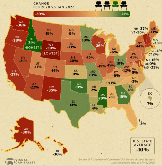
This map shows something about Employment in each US state between 2020 and 2026.
What do you think that is?
Please vote in the poll, and add an opinion if you want?
Correct answer will be given in a few days, Monday.
Updates
3 mo
"Change in each state's number of job openings" is the correct answer.
The map shows whether the total number of job openings in each state, between February 2020 and January 2026, went up (green, +%) or down (red, -%), with darker colors indicating farther from 0%.
The map shows that Idaho had the highest increase in job openings while Wyoming had the highest decrease in job openings.
Congratulations to the one person that got this right.
The map shows whether the total number of job openings in each state, between February 2020 and January 2026, went up (green, +%) or down (red, -%), with darker colors indicating farther from 0%.
The map shows that Idaho had the highest increase in job openings while Wyoming had the highest decrease in job openings.
Congratulations to the one person that got this right.