 Girl's Behavior
  Guy's Behavior
  Flirting
  Dating
  Relationships
  Fashion & Beauty
  Health & Fitness
  Marriage & Weddings
  Shopping & Gifts
  Technology & Internet
  Break Up & Divorce
  Education & Career
  Entertainment & Arts
  Family & Friends
  Food & Beverage
  Hobbies & Leisure
  Other
Other  Religion & Spirituality
  Society & Politics
  Sports
  Travel
  Trending & News


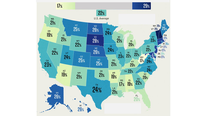
This map of US states shows something about workers in each state.
Do you know what that is?
Please make your guess in an opinion.
Correct answer will be given in a few days (Friday).
Updates
6 mo
Congratulations to those who got this.
The map shows, for each state, the percentage of people over 65 (typical retirement age) who are still working.
Until I saw this, it never occurred to me that 1 in 5 Americans over 65 is still working. I wonder if those who continue to work do it voluntarily, or whether it's necessary to survive and continue their lives.
The map shows, for each state, the percentage of people over 65 (typical retirement age) who are still working.
Until I saw this, it never occurred to me that 1 in 5 Americans over 65 is still working. I wonder if those who continue to work do it voluntarily, or whether it's necessary to survive and continue their lives.


























Most Helpful Opinions