Girl's Behavior
  Guy's Behavior
  Flirting
  Dating
  Relationships
  Fashion & Beauty
  Health & Fitness
  Marriage & Weddings
  Shopping & Gifts
  Technology & Internet
  Break Up & Divorce
  Education & Career
  Entertainment & Arts
  Family & Friends
  Food & Beverage
  Hobbies & Leisure
  Other
Other  Religion & Spirituality
  Society & Politics
  Sports
  Travel
  Trending & News
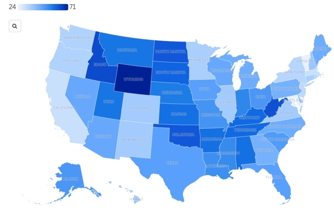
What do you think this US map represents?
Correct answer will be given in a few days. Thursday.
Updates
1 y
The scale at the upper left is in percent (%). The map shows each state's approval rating of President Trump after his first 100 days in office. The darker the state's color is, the more positive is that state's approval rating. The lighter the state's color is, the less positive (or more negative) is that state's approval rating.
The darkest states are strong red Republican states, while the lightest states are strong blue Democratic states.
The darkest states are strong red Republican states, while the lightest states are strong blue Democratic states.