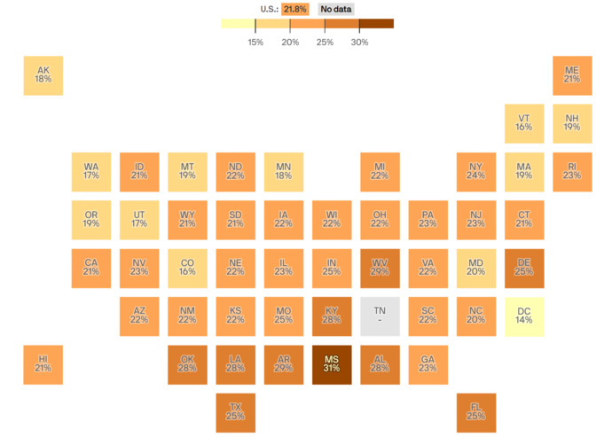
Here's a pseudo-map of the United States.
What do you think it represents?
Please vote in the poll.
The correct answer may, or may not, be one of the poll choices.
 Girl's Behavior
  Guy's Behavior
  Flirting
  Dating
  Relationships
  Fashion & Beauty
  Health & Fitness
  Marriage & Weddings
  Shopping & Gifts
  Technology & Internet
  Break Up & Divorce
  Education & Career
  Entertainment & Arts
  Family & Friends
  Food & Beverage
  Hobbies & Leisure
  Other
Other  Religion & Spirituality
  Society & Politics
  Sports
  Travel
  Trending & News
 Here's a pseudo-map of the United States.
What do you think it represents?
Please vote in the poll.
The correct answer may, or may not, be one of the poll choices.
Opinion
6Opinion
The only opinion from girls was selected the Most Helpful Opinion, but you can still contribute by sharing an opinion!
You can also add your opinion below!
