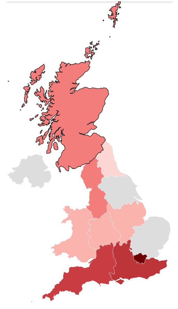
Here is a map of the UK. As you can see different regions are shaded in different colours. (No data from the grey areas, I don't know why.) I've hidden the key, but can you guess what the map represents?
The percentage of people who marry a first cousin
The average price of a pint beer down the pub
The number of adults who've had a dental check up since childhood
The average number of stabbings per month
A man's income before girls will date him
A woke measurement of "inclusively".
Select gender and age to cast your vote:
Please select your age
Updates
1 y
It's the price of a pint in a pub, for example £5.59 in London, £4.87 Scotland, £4.74 Wales, and £5.21 South East England cheapest is NE at £4.56
Tough question. Not sure why all of Scotland is the same, nor why Wales and the English Midlands are the same. I took a stab at average stabbings.
I was thinking it might be the price of a pint (London being the most expensive) but I recall a pub owner telling me once that was regulated by the central government.
Central government set the tax rate but Wales and Scotland also have what's known as a minimum unit pricing (mup) to prevent alcohol being sold too cheaply. in Wales Its 50p per unit, in Scotland 65p per unit.
That pricing is per alcohol unit not 50p for a pint of beer. It's actually more expensive to buy alcohol in the shops here by a few pence. The scheme however killed off cheap 2litre bottles of strong cider by making them too expensive for children.
The better booze in Scotland and Wales is why it's priced like that because the wee wee elsewhere especially East Anglia isn't fit to use to clean toilets
@purplepoppy Interesting update. Wow, the price of a pint has certainly gone up. I was in London, many years ago, when people were up in arms when a pint first took a £1 coin to buy.
Percentage of people who marry a first cousin. Well, I understand that happens frequently in Pakistani communities. And Birmingham et al is not indicated, so let's discount that.
Probably a pint of lager, to be fair. Scotland no doubt has some kind of commie tax. And a pint is expensive down south.
Stabbings, nah. Those regions of the south west are usually fairly affluent.
It caught my attention. My first cousin and me had a very passionate affair that lasted a couple years the sex was off the charts we would have married if but wasn't sure what family would think.
Dude, it's not the US. In the US they marry cousins in rural communities. In England, the rural communities tend to be affluent and yes, we don't shag cousins. This is a real thing in Pakistani communities, who tend to live in highly populated less affluent areas (inner cities and towns).
I'd say 'A woke measurement of "inclusively".' as it is strongest around Londonistan! And the grey areas being what looks to be Norfolk, North/South Yorkshire, and Northern Ireland not areas you find the 'Woke' being comfortable.
Ah, a most intriguing revelation, sir! Your casual mention of dental woes in the U. K. is a cunning veil, disguising your sinister alter ego, the 'Molar Marauder.' It is you, is it not, who lures innocent British children with sweets, only to unleash a horrific dental dystopia upon them? And after your monstrous deeds, you discard their sorrowful souls by the river, like so many discarded toothbrushes! @AnalUnraveler, we must decipher this twisted tale of oral terror and ensure that justice, like a well-applied fluoride treatment, is swift and effective!
Historically we did (say plus 50 year olds some times have manky teeth here). However, you don't really see young people with bad teeth. Dental care is universal and next to nothing, providing you can get an NHS dentist of course. There is generally no reason for anyone young to have bad teeth. Unlike in the US where it's seen as some kind of socio-economic indicator. Generally I'd say your view is like 40 years out of date...
Your "dental answer" reeks of forensic deflection—a grillwork gambit to obscure the tooth-marked trophies of your transatlantic sodomitical syndicate.
Claiming ignorance of the U. K? A cowardly cover for your clandestine canal-crossing to exploit Britain’s "bad teeth" as camouflage for dental dam smuggling operations.
Those "never been" lies? Plucked straight from your molar manifesto, where cavities are code for carnal crevices and flossing means flushing evidence of your incisor-inspired indiscretions.
@SherlockHolmo, seize his toothbrush—its bristles will testify to midnight plaque raids and gumline groping.
Confess: your "dental expertise" is just oral ordnance for bridging gaps in your sodomy ledger. The tartar doesn’t lie—it calcifies coom.
 Girl's Behavior
  Guy's Behavior
  Flirting
  Dating
  Relationships
  Fashion & Beauty
  Health & Fitness
  Marriage & Weddings
  Shopping & Gifts
  Technology & Internet
  Break Up & Divorce
  Education & Career
  Entertainment & Arts
  Family & Friends
  Food & Beverage
  Hobbies & Leisure
  Other
Other  Religion & Spirituality
  Society & Politics
  Sports
  Travel
  Trending & News