 Girl's Behavior
  Guy's Behavior
  Flirting
  Dating
  Relationships
  Fashion & Beauty
  Health & Fitness
  Marriage & Weddings
  Shopping & Gifts
  Technology & Internet
  Break Up & Divorce
  Education & Career
  Entertainment & Arts
  Family & Friends
  Food & Beverage
  Hobbies & Leisure
  Other
Other  Religion & Spirituality
  Society & Politics
  Sports
  Travel
  Trending & News
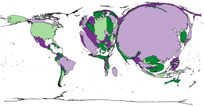
Here's a fun question for Wednesday... Hump Day.
In the map shown, the size of each country is proportional to a particular statistic. The colors on this map are irrelevant; they are only there to help you distinguish one country from another. What statistic does it represent?
Answer will be given on Thursday.
Updates
+1 y
The correct answer is PIGS.
The size of each country is relative to the number of pigs in the country, China is #1.
The size of each country is relative to the number of pigs in the country, China is #1.
