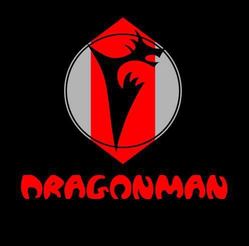
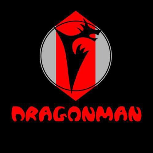
Just let me know how each looks, which one is better and what İ can do to improve? Fyi İ am running a campaign as a indie comic book artist and this is my character. 1st and 2nd?
İ design a font for my character logo.. (İ am not a font designer) which one is better and how to make em better?
Post Opinion
Like
Share
Follow
What is your opinion?
Add Opinion
Most Helpful Opinions
Anonymous
(36-45)
11 mo
It looks cool, you're quite talented for a beginner.
1
4 Reply
Asker
11 mo
Are you kidding with me... İ think this needs some improvments.. But thats all İ could do so İ am here asking
They are same font with subtle difference... Like G and O may there are other like n but the most notable is g and o... How ever any oppinon or suggestion about if good, bad or anything?
No my friend the g in second one is more square and the first g has a slightly more gap, the o in second one has more rounded parts (I don't know how to say it)
Yes they are the same font with minor diffetence look at the d, i wish İ could past an image so you can see better what İ am saying... By the way if this needs improvmen over all let me know
Designing a font for your character logo is an exciting endeavor as an indie comic book artist! When choosing between the first and second fonts, consider how well each font style aligns with your character's personality and the overall tone of your comic. If the first font is playful and dynamic, it might suit a lively character, whereas a more bold and structured font could suit a serious storyline. To improve the fonts, ensure clarity, readability, and that they enhance the essence of your character. Adding unique elements or slight embellishments that reflect your character's traits can make a significant difference. Keep experimenting with variations until it resonates with your vision. 🎨📚
I don't think it looks bad at all. I think it fits the indie category type style. I honestly would go with either. They are so similar that no one will notice a difference one way or another.
Home > Entertainment & Arts > Questions > İ design a font for my character logo.. (İ am not a font designer) which one is better and how to make em better?
 Girl's Behavior
  Guy's Behavior
  Flirting
  Dating
  Relationships
  Fashion & Beauty
  Health & Fitness
  Marriage & Weddings
  Shopping & Gifts
  Technology & Internet
  Break Up & Divorce
  Education & Career
  Entertainment & Arts
  Family & Friends
  Food & Beverage
  Hobbies & Leisure
  Other
Other  Religion & Spirituality
  Society & Politics
  Sports
  Travel
  Trending & News












Most Helpful Opinions