378 opinions shared on Entertainment & Arts topic.
I like it. You have a clear unique style that's consistent. I feel like I'm kinda seeing where some of the inspiration is coming from but it feels very original.
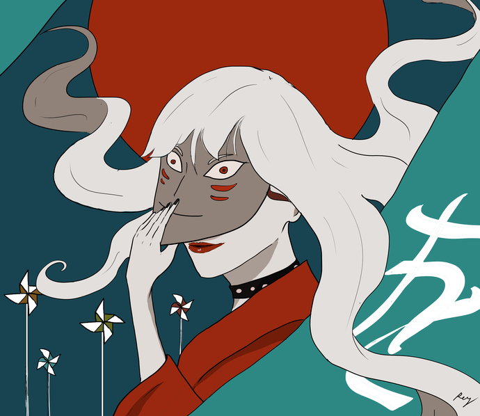
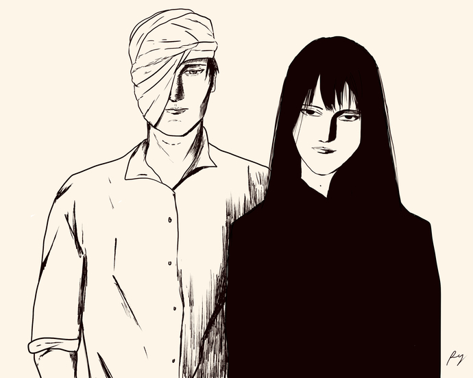
I think my favorite part about it is everything implies motion. The first girls pose and the way the hair is hanging, the slow, maybe reluctant pull of the mask, the couple sort of inching together waiting for the photo to be taken.
I think this shows a lot of versatility. However my one critique (and I don't really know what you can do about it) no matter how carefully you pick colors it's so easy to get into situations where it's hard to tell why the shade of something changed.
The only example I see here is the mask girls hair on the upper left. I can't tell if it's some kind of hilight or the lighting or what. But I guess that's the tradeoff of the style but I think if you can find a way to shade finer details similar to how you did the guys shirt on the bottom, you'll have a style that can work in any situation commercially.
364 opinions shared on Entertainment & Arts topic.
It feels totally wrong to me to rate an art style, I won't do that.
I like how the second one features clean lineart, plain colours, that complimentary red-turquoise too. Also how shapes deploy on the canvas, it feels very lively.
I can’t see your art here, so I can’t fairly rate your style yet 😅 If you upload or link an image, I can compare things like line quality, color palette, composition, and mood to established artists or styles, like Studio Ghibli, Loish, Klimt, or Sargent.
Right now I’d just be guessing, and your work deserves better than that 💛
It's very good. The problem is that there are untold thousands of people who are also very good. The same reason I didn't persue a commercial helicopter license. It's amazing how many people can fly helicopters. It is a unique style though and not affiliated with some huge corporation. Do you draw graphic novels or anything?
2.7K opinions shared on Entertainment & Arts topic.
Yes, you are very good and your style is reminiscent of multiple other artists one whose name I cannot think of but he is the guy who did the cover of the Duran Duran album. Rio.
 Girl's Behavior
  Guy's Behavior
  Flirting
  Dating
  Relationships
  Fashion & Beauty
  Health & Fitness
  Marriage & Weddings
  Shopping & Gifts
  Technology & Internet
  Break Up & Divorce
  Education & Career
  Entertainment & Arts
  Family & Friends
  Food & Beverage
  Hobbies & Leisure
  Other
Other  Religion & Spirituality
  Society & Politics
  Sports
  Travel
  Trending & News
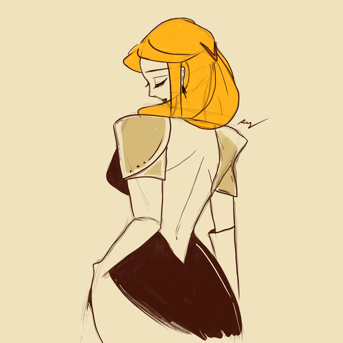

Most Helpful Opinions