 Girl's Behavior
  Guy's Behavior
  Flirting
  Dating
  Relationships
  Fashion & Beauty
  Health & Fitness
  Marriage & Weddings
  Shopping & Gifts
  Technology & Internet
  Break Up & Divorce
  Education & Career
  Entertainment & Arts
  Family & Friends
  Food & Beverage
  Hobbies & Leisure
  Other
Other  Religion & Spirituality
  Society & Politics
  Sports
  Travel
  Trending & News
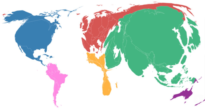
Here's a World Map with groups of countries shown in sizes different from their actual sizes. That's done for a specific reason in this map.
What do you think the sizes refer to on this map?
Answer will be given tomorrow (Sunday).
Updates
+1 y
Answer time...
The size correlates to the amount of Carbon emissions the area puts into the atmosphere, from Asia (the most, mainly because China uses so much coal) to Africa (not so much).
The size correlates to the amount of Carbon emissions the area puts into the atmosphere, from Asia (the most, mainly because China uses so much coal) to Africa (not so much).

Most Helpful Opinions