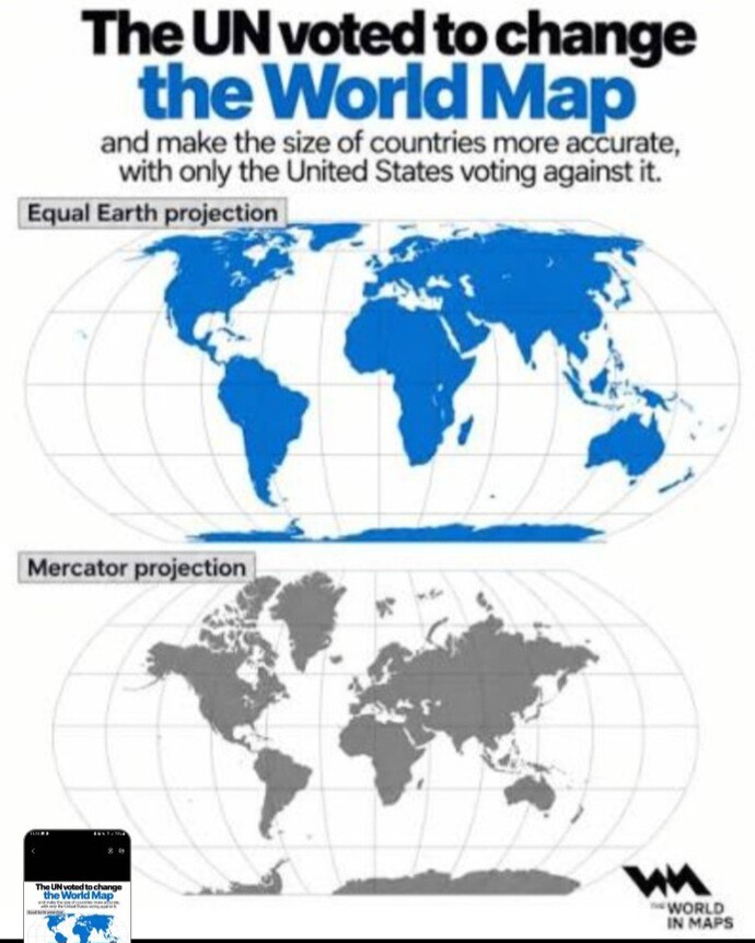
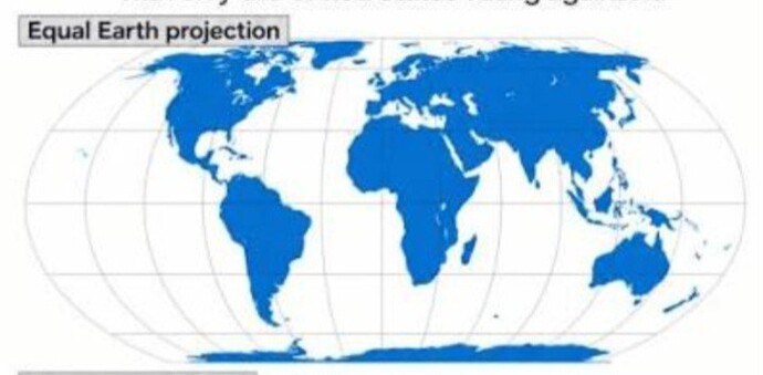
Every country in the world except the USA has just agreed to replace the old Mercator map with the new Equal Earth map. It's always been known flat maps distort the world and there's no perfect one.
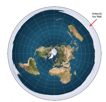
Interesting the Whitehouse argument they need to own Greenland because it's in the middle is based on the Flat Earth map.
Both are distortions. I get the point of the new map, but it really isn't much better. The Earth is, roughly, a sphere (more correctly, a spheroid, because it isn't perfectly round), and you will never have a flat map that isn't distorted.
The problem isn't the map as much as it is the lack of education and critical thinking skills. Our schooling doesn't teach children to THINK, at best it teaches how to memorize and regurgitate until test time, but actually understanding the underlying concepts isn't given much importance (and this is not accidental).
Most younger folks (and plenty of my own generation) do not understand the underlying reason for the Mercator Projection and what that means in terms of the size distortion increasing the further away from the equator. That's not a terribly complicated thing to understand, but as a society, we don't put nearly enough importance on deeper understanding of concepts, so fewer and fewer people understand how to apply the knowledge they DO have. I worry that the new map is more of a crutch for those who don't understand the old map then a real solution.
The world is experiencing a huge birthrate crisis, and that, along with degrading education (and degrading expectations) is likely to result in not just a lack of technological growth, but a reversion. With so many fewer people being born, the most capable will have to be diverted towards keeping the basic infrastructure running, which means only a small fraction left available for science and technology. And because of education degradation, there just won't be enough people who have the depth of knowledge to keep pushing things forward or even maintain what we have.
We like to pretend that everyone has equal potential, but that has never been true, and the truth is that the people who believe that are only able to maintain that belief by LOWERING the expectations for everyone, so that most people's results are similar. You might get away with that with a growing population, but not with a rapidly shrinking one.
I see the new map as an example of another lowered expectation. Yes, more people will have a better idea of relative landmass sizes, but they'll have less understanding of geometry and cartography and basic logic, and that's a lowered expectation that is more harmful in the long run.
We already have large groups of college students who can't read at an 8th grade level or do basic arithmetic. Lowered expectations aren't the right direction.
Either works although the old map is more relevant for travel as I understand it. The idea with the new map is to show how big Africa is which makes it all the more fascinating that they cannot take care of themselves and need to migrate to tiny Europe.
Over the next 100 years Africa will attract investors such as China today. This just means that more productive societies will bring Africa up to modern standards as they just can’t seem to do it themselves. I was just in Africa again and will be again in early 2027.
Like most areas of the world where there is potential but no progress, it boils down to the culture of the local population. A key theme there is they don’t work together, they would rather get over on each other.
Yes, that is what I meant when I said “such as China today”. China wants the minerals and rare earth. The West was slow to see that even though it was talked about including that China would create a monopoly on it. But money and power will change things in the future. China will not control all of it.
Funny how the map of more realistic sizes shows everything getting smaller as you proceed north? Is that because of the well known fact that certain things do experience shrinkage when it's cold? I prefer the map that more closely depicts reality. here's an interesting map overlaying the two for comparison...
It shows the true size of countries without utilizing a globe and writes away the ideas we had in our head from the old maps. It is an improvement, so I like it.
I’ll always love globes more since they’re more correct to America’s true landmass sizes than a traditional map could ever achieve since our planet’s true shape is an oblate spheroid.
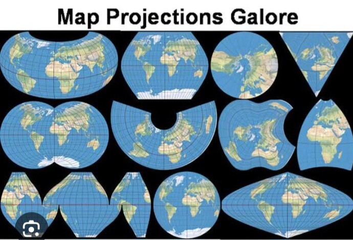
I don't know why they were using Mercator. Robinson was the most logical. I don't know what the differnce is between Equal Earth and Robinson.
The only thing I'm annoyed about is the black nationalists are convinced they finally agknowldged that Africa is bigger than Asia, which we didn't, and it isn't.
But all the problems in the world, and THIS is what the UN is prioritizing🤦♂️
I'm not surprised the US voted against it though. We disagree with pretty much everything the UN does
I prefer facts, and it’s good to know that there’s more room in Africa than we thought. They won’t be overcrowded when we send all our deadbeats and criminals back where they came from. Ell oh ell!
Difficult to say which map I prefer, because we're so accustomed to see the old map, and the new one, although more realistic, seems a bit out of balance. Everything is relative, but the truth should still prevail, shouldn't it?
 Girl's Behavior
  Guy's Behavior
  Flirting
  Dating
  Relationships
  Fashion & Beauty
  Health & Fitness
  Marriage & Weddings
  Shopping & Gifts
  Technology & Internet
  Break Up & Divorce
  Education & Career
  Entertainment & Arts
  Family & Friends
  Food & Beverage
  Hobbies & Leisure
  Other
Other  Religion & Spirituality
  Society & Politics
  Sports
  Travel
  Trending & News












What Girls & Guys Said
Opinion
17Opinion
Both are distortions. I get the point of the new map, but it really isn't much better. The Earth is, roughly, a sphere (more correctly, a spheroid, because it isn't perfectly round), and you will never have a flat map that isn't distorted.
The problem isn't the map as much as it is the lack of education and critical thinking skills. Our schooling doesn't teach children to THINK, at best it teaches how to memorize and regurgitate until test time, but actually understanding the underlying concepts isn't given much importance (and this is not accidental).
Most younger folks (and plenty of my own generation) do not understand the underlying reason for the Mercator Projection and what that means in terms of the size distortion increasing the further away from the equator. That's not a terribly complicated thing to understand, but as a society, we don't put nearly enough importance on deeper understanding of concepts, so fewer and fewer people understand how to apply the knowledge they DO have. I worry that the new map is more of a crutch for those who don't understand the old map then a real solution.
The world is experiencing a huge birthrate crisis, and that, along with degrading education (and degrading expectations) is likely to result in not just a lack of technological growth, but a reversion. With so many fewer people being born, the most capable will have to be diverted towards keeping the basic infrastructure running, which means only a small fraction left available for science and technology. And because of education degradation, there just won't be enough people who have the depth of knowledge to keep pushing things forward or even maintain what we have.
We like to pretend that everyone has equal potential, but that has never been true, and the truth is that the people who believe that are only able to maintain that belief by LOWERING the expectations for everyone, so that most people's results are similar. You might get away with that with a growing population, but not with a rapidly shrinking one.
I see the new map as an example of another lowered expectation. Yes, more people will have a better idea of relative landmass sizes, but they'll have less understanding of geometry and cartography and basic logic, and that's a lowered expectation that is more harmful in the long run.
We already have large groups of college students who can't read at an 8th grade level or do basic arithmetic. Lowered expectations aren't the right direction.
Either works although the old map is more relevant for travel as I understand it. The idea with the new map is to show how big Africa is which makes it all the more fascinating that they cannot take care of themselves and need to migrate to tiny Europe.
Over the next 100 years Africa will attract investors such as China today. This just means that more productive societies will bring Africa up to modern standards as they just can’t seem to do it themselves. I was just in Africa again and will be again in early 2027.
Like most areas of the world where there is potential but no progress, it boils down to the culture of the local population. A key theme there is they don’t work together, they would rather get over on each other.
China is already heavily investing in Africa. Only matter of time before they lay claim to it.
Yes, that is what I meant when I said “such as China today”. China wants the minerals and rare earth. The West was slow to see that even though it was talked about including that China would create a monopoly on it. But money and power will change things in the future. China will not control all of it.
Funny how the map of more realistic sizes shows everything getting smaller as you proceed north? Is that because of the well known fact that certain things do experience shrinkage when it's cold? I prefer the map that more closely depicts reality.
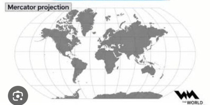
here's an interesting map overlaying the two for comparison...
Brazil and Africa become yuuuuge...
I found that pic when looking for images. Interesting but sort of implies there's a sea between the USA and Canada
True... maybe there are Canadians who would welcome this new feature... wouldn't blame them.
It shows the true size of countries without utilizing a globe and writes away the ideas we had in our head from the old maps. It is an improvement, so I like it.
I’ll always love globes more since they’re more correct to America’s true landmass sizes than a traditional map could ever achieve since our planet’s true shape is an oblate spheroid.
I don't know why they were using Mercator. Robinson was the most logical. I don't know what the differnce is between Equal Earth and Robinson.
The only thing I'm annoyed about is the black nationalists are convinced they finally agknowldged that Africa is bigger than Asia, which we didn't, and it isn't.
But all the problems in the world, and THIS is what the UN is prioritizing🤦♂️
I'm not surprised the US voted against it though. We disagree with pretty much everything the UN does
https://xkcd.com/977/
I prefer facts, and it’s good to know that there’s more room in Africa than we thought. They won’t be overcrowded when we send all our deadbeats and criminals back where they came from. Ell oh ell!
I don't care but I guess more accurate is better. I'm sure Trump said no because it would make the US look smaller and his ego can't handle that 🙄
Greenland in size of Africa fuels phantasy of little Peter Pan in Washington.
I prefer Robinson projection world maps
great... now we cannot ever say that the UN has never done anything substantial for Africa...
Difficult to say which map I prefer, because we're so accustomed to see the old map, and the new one, although more realistic, seems a bit out of balance. Everything is relative, but the truth should still prevail, shouldn't it?
Why is there no "I don't give a crap, option"? As you mentioned all flat representations of a sphere are distorted. Pick a distortion and move on.
We can place both in a museum.
Myself, I use Google Earth and GPS.
The Merc is more inclusive but shifts the equator to being ABOVE Florida!!
new one looks good!!🌎 it made sense to change it👍🏻
I like both but the new one is more realistic.
Meh. Maybe Trump will invade Africa instead of Greenland now...
why make africa larger? its a shithole and nobody cares about it
The new one is more accurate.
I don't think it really matters.
Prefer older