 Girl's Behavior
  Guy's Behavior
  Flirting
  Dating
  Relationships
  Fashion & Beauty
  Health & Fitness
  Marriage & Weddings
  Shopping & Gifts
  Technology & Internet
  Break Up & Divorce
  Education & Career
  Entertainment & Arts
  Family & Friends
  Food & Beverage
  Hobbies & Leisure
  Other
Other  Religion & Spirituality
  Society & Politics
  Sports
  Travel
  Trending & News
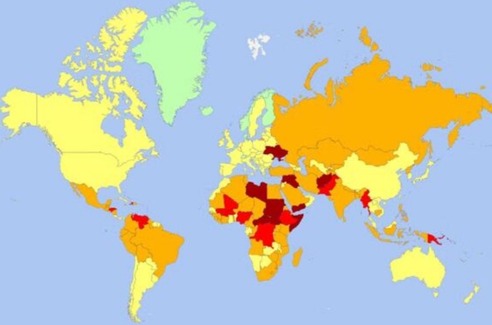
This map shows how dangerous a country is considered to be.
Green indicates the safest while dark brown indicates the least safe. Yellow to tan to red indicate increasing levels of being considered unsafe.
Is this map accurate? What do you think?
Updates
1 y
The map was published in an article in The Independent newspaper. Its source was not mentioned in the article.
Updates
1 y
From my knowledge of world politics, the map is reasonable. As many have pointed out, the yellow and orange countries (and maybe others too) generally should have pockets of green and red.
