 Girl's Behavior
  Guy's Behavior
  Flirting
  Dating
  Relationships
  Fashion & Beauty
  Health & Fitness
  Marriage & Weddings
  Shopping & Gifts
  Technology & Internet
  Break Up & Divorce
  Education & Career
  Entertainment & Arts
  Family & Friends
  Food & Beverage
  Hobbies & Leisure
  Other
Other  Religion & Spirituality
  Society & Politics
  Sports
  Travel
  Trending & News
 Some logo designers should take a closer look of what they designed. Because some of them looks like a completely different thing. Or is it just me who has a dirty mind? Comment below if you see them the same way that I do.
Dirty bird
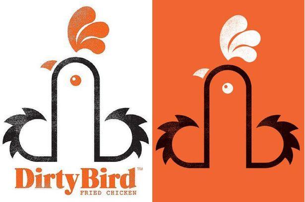
It looks like a dick ejaculating.
Ruben's nuts
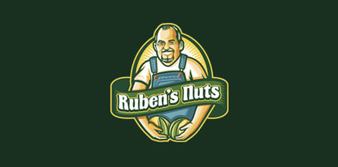
Even the name matches.
Fully erected tents

Is it the tent which is erected or something else?
The computer doctors

Ohh just realized that it is just a mouse.
Kostelecke uzeniny

That's not the right place for the sausage.

Most Helpful Opinions