What is your favourite colour and would you like me to tell you its use or what it says about your personality? (Page 2)
Ask AI
 Girl's Behavior
  Guy's Behavior
  Flirting
  Dating
  Relationships
  Fashion & Beauty
  Health & Fitness
  Marriage & Weddings
  Shopping & Gifts
  Technology & Internet
  Break Up & Divorce
  Education & Career
  Entertainment & Arts
  Family & Friends
  Food & Beverage
  Hobbies & Leisure
  Other
Other  Religion & Spirituality
  Society & Politics
  Sports
  Travel
  Trending & News
 You can also add your opinion below!

What Girls & Guys Said
Opinion
51Opinion
Teal, emerald, burgundy
See my response to Spiffy_and_Tails for core green traits.
Teal
A dark blue-green. Darker than turquoise (and more calm, even)
Teal takes its name from the teal duck, a petite freshwater fowl found in Europe, Asia, and North and South America. In certain breeds, the male's eyes are ringed in the attention-getting hue during mating season. This is known as "nuptial plumage" because it is meant to attract females
A transitional colour, bridging blue and green
Meditative, mysterious, graceful, sophisticated
Turquoise + twilight = teal
Pair with red, magenta, yellow, silver
Can be either stately or more contemporary and fun, depending on what other colours you pare it with. Can be loud or quiet and sedate
Emerald
Emerald is synonymous with wealth, prosperity and luxury, so it works with other colours that evoke the same air of richness and elegance. Many other jewel tones mix well with emerald green, but in particular deep blues and shimmery golds and brass; Plays well with lacquers such as black; A great colour to punctuate all-white; Works well with deep blues and golds
Pantone colour of the year for 2013
In places like Bogota, where merchants sell emeralds out on the street (so they can be seen through natural light), the darker the stone, the higher the value
A rich jewel tone
Dramatic
Elegant
Brings a sense of clarity, renewal and rejuvenation
Malachite is a good, complex example, coming from a natural stone with some figuring, and also some shade variations
a pale pastel pink color or periwinkle
Carrie Bradshaw, Sarah Jessica Parker, Sex and the City
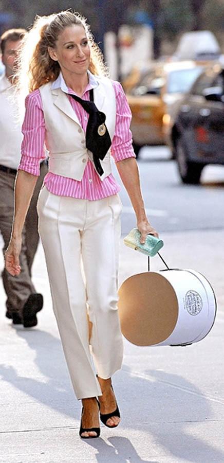
For the pastel pink see female user TheLittleInnocent
Periwinkle is playful, sprightly, whimsical.
For the blue colour theory see my reply to male user mk200195
periwinkle is a pale blue purple grey color not whatever he said
White. And sure, go ahead.
Oh gee, thanks.
See my response to Billie_
Sure, let's say pink or aqua blue
See my reply to female user TheLittleInnocent for the pink
and male user mk200195 for blue theory
That is quite a lot to take in... But all great info! It's pretty awesome! I'd like to see this in a my take. To see everything in one place. But what you have done here is very cool in it's own sense
Red.
Always liked it.
See my reply to pink user LilytheHorcrux for the red
Plaid.
It's timeless and screams fall, warm, and cozy
Originally called Tartan by the Scottish in the 1500s. When British and American manufacturers started replicating the tartan print, they began calling it plaid
While all tartans are plaid, not all plaids are tartan
Classic and conservative
Pairs well with florals
Plaid may have had its biggest moment in the '70s when it was used on everything from shirts to suits to chairs – all evident in hit shows like The Brady Bunch and Charlie's Angels. But the pattern didn't remain mainstream for long. In the late '80s, it was adopted by counterculture musicians in the Pacific Northwest, with grunge bands like Nirvana and Pearl Jam appropriating the print. Then, in the mid-90s, came Clueless, the movie in which wealthy, popular, Beverly Hills teens made the print posh once more
You appreciate tradition and unpretentious relaxed comfort with a nod to the past.
That's great!
I suspected a plaid jacket would go well over a Hawaiian floral print shirt.
And shorts.
:)
Yep. Mixing bold patterns is actually very on trend, too. Makes them less... stuffy.
I like ocean blue. loves grape.
See my reply to male user mk200195
And Guardian45 for the grape
Light blue, colour of ocean..
Lots of info here. Browse around if you like.
The main blue info is under male user mk200195.
Green is my favorite color.
See my response to Spiffy_and_Tails
blood red or pitch black
The lovely Ana de Armas
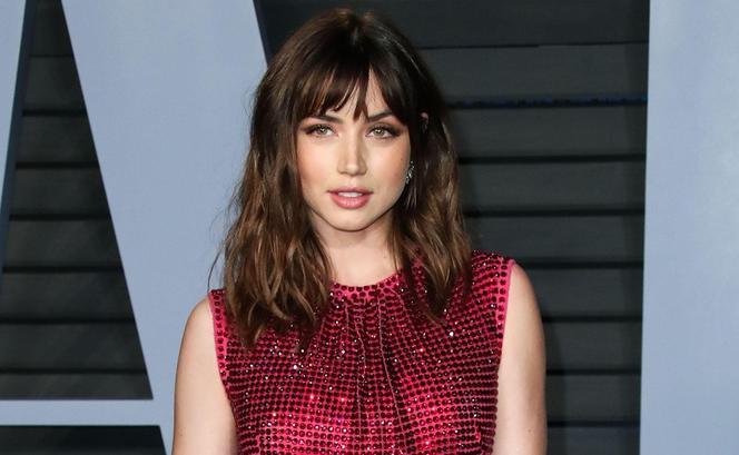
See my reply to pink user LilytheHorcrux for the red
and blue ser Anpu23 for the black
Red and blue.
I like to wear black though.
See my reply to female user LilytheHorcrux for the red and male user mk200195 for the blue.
Red but as an accent.
See my reply to pink user LilytheHorcrux for the red
I don’t know the exact name, but something blue.
Wow... that’s specific!
@Geckoman What, you’ve got the name of every shade of every color memorized?
More towards the middle blue. Like sky or sea blue
See my response to female user 1828avaava1828 for the sky blue
and male user mk200195 for blue general theory
Red is my favorite color.
See my reply to pink user LilytheHorcrux for the red
Dark purple
See Guardian45
Crimson
See my reply to LilytheHorcrux
Thanks. Not my personality but I understand the theory
Fair enough.
Sea foam green
See the various green responses.
Sea foam has a lot of white added to it. It is soft and somewhat creamy, not bright, not deep, and more soft.
Dark purple
Please see my response to Guardian45.
Black.
See Anpu23
Emerald green
See various green responses.
Blue
See my reply to male user mk200195
ok, thanks
I like dark greens
See my reply to Spiffy_and_Tails
Mine is baby pink
See my reply to TheLittleInnocent
Plum 😊
See my response to Guardian45 for purple core theory.
Variations:
Variations are diverse and complex
At their most dark, they are dramatic and theatrical
Paler versions like lilac are more conventional and restful
Mid- to deeper or greyed-down versions are mysterious, mystical, inscrutable
Lighter hues such as lavender and mauve are wistful and nostalgic
The darker the shade, the more sophisticated
Blue-based purples are less pinkish, less passionate, and more sober
Leaning to the blue side, it has more dignity and serenity
Dark purples are formal and Victorian
Deeper purples and violets have a powerful yet introspective association
Dusky purples feel adult and moody
Keep tones a bit muddy. Anything too clear or bright runs the risk of looking too carnival
Plum is a softer, more mellow variety of the purples, greying it out just a tad.
Plum:
A mix of red and blue, so plum tends to go well with colours that mix with them as well
Dynamic
Full-bodied
Surprisingly versatile
If you use plum in large doses, red won’t be able to overtake it
Warm
Works well with red and deep blue or indigo