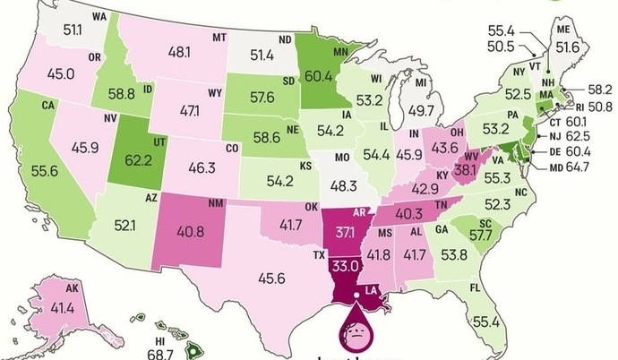
WOW!! This map blew me away!! What is it of?


Thats gotta be the happiness index. You’ll notice the least happy states are major red ones. there's some blue of course but it doesn’t disprove the point: red states = not happy!
Based on the frown face in the bottom, I’m going to say happiness index even though I’m 99.9% sure I’m wrong since I suck at these maps.
Opinion
12Opinion
This is a tough one. Trying to figure out why New Orlesns is highlighted. The lower numbers seem to be Bible Belt states, where religion is high, while Utah, which is mostly Mormon, is a high number.
I have to go with the televangelists.
No sorry
Difficult. These types of maps tend to be made about stuff like happiness but I always thought people in NY were permanently miserable. I'm going with the hotdog one.
Hey!!! I'm NYer!!
There is only one answer to this question! There are a lack of sewers in USA, and too many cesspits. The answer is 100% the cesspit answer.
No sorry!
I live in Louisiana, so yeah, this is believable. The worst life expectancy and usually highest or second highest level of poverty and also least educated all wrapped into one place.
I saw that Louisiana was dark pink, then I thought of Mardi Gras, then I saw Good Friday, and it's almost Easter... so I don't know lol
Percentage of fat/obese people in each state !!!
Good one
Population never donated to televangelist, in my opinion...
Sorry no
Maybe A?
Can you guess this map? What is this a world map of? ↗
I'm going to go out on a limb and guess it's about meter maids and Republicans killing and eating their young?
Percentage of insane people.
Where did you get blown TO?
Maybe happiness percentages
Available job openings?
Love Sauerkraut!
Give it a rest
You can also add your opinion below!
Most Helpful Opinions