 Girl's Behavior
  Guy's Behavior
  Flirting
  Dating
  Relationships
  Fashion & Beauty
  Health & Fitness
  Marriage & Weddings
  Shopping & Gifts
  Technology & Internet
  Break Up & Divorce
  Education & Career
  Entertainment & Arts
  Family & Friends
  Food & Beverage
  Hobbies & Leisure
  Other
Other  Religion & Spirituality
  Society & Politics
  Sports
  Travel
  Trending & News

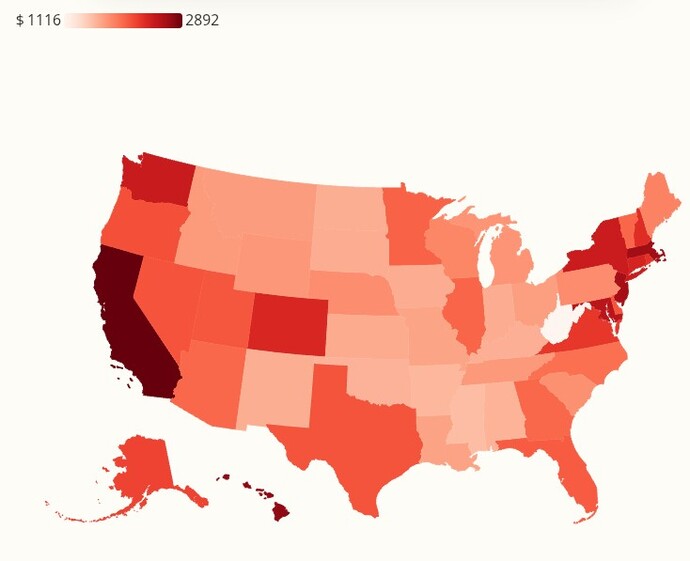
What do you think this US MAP shows?
Please vote in the poll.
Hint: The darker the color, the higher the number.
Correct answer will be given in a few days, Friday
Updates
4 mo
Newsweek reported this map and the associated article. It shows
"Average total cost of bills per month".
"Average total cost of bills per month".