No poll. Just guess. What is this a map of?


I don't know how to put my guess into words.
I believe it is the “money” certain states give to the government and how much it equates to in relation to states like Texas and New York.
Like $2 to fed govt in taxes, you get a return of $4. All those red states with ‘CA’ combined is the amount California pays.
This is a guess, another could be population though personally not sure.
Someone's acid trip?
Appears to be a totally fucked up map of the United States! I hope you tell us what this is all about?
Internal migration by number one influx
a map of the united states: wrong answers only!! 🇺🇸🇺🇸
A+ for you!
yayyy!!😂
tyy MHO @DrPepper12 😊🇺🇸
How's that wrong?
Opinion
21Opinion
What state people most often moved from before living there?
States where Democrat voters are moving to and taking their terrible ideas and policies with them?
Lol 😂😂😂
States where people from other states are moving in the greatest numbers.
Example, lots of people fleeing California. Lots of New Yorkers moving to Florida.
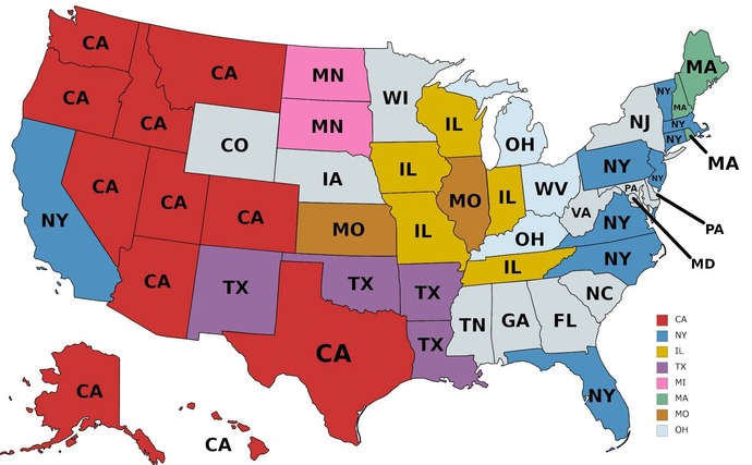
I'm tempted to say it's states where the most domestic immigrants come from. For example all those states marked Ca have more immigrants from California than any other state. Obviously a plurality not a majority.
If this is the case, I think it needs a disclaimer. This looks more like the states they lived in most recently, not the state they ORIGINALLY came from, or lived in the longest.
Asking people the worst state. Look at Texas and my guess football rivals is a part of it. California being the perfect place to live everyone is jealous and California hating new york with a east cost vs west cost riverly.
It's an internal immigration map.
Among people born out of the state, it shows the state from which the largest community comes.
In Alaska, the majority comes from California; In Florida, the majority comes from NY...
Looks like the most common state that people in that state migrated from. For example, much of Florida's population increase are relocated New Yorkers, and the block of red CA states is where the bulk of Californians are fleeing their state.
it is where people from California, New York and Massachusetts have fled to after they get fed up with crime, high taxes, illegal aliens and liberals.
I know this one. That is a map of the United States of America.
A map showing what state where the majority of people moved there from?
To me it looks like a map of the U. S. A. ?
Probably an internal migration chart about where the migrants arrived from?
the USA after they stole it from the native tribes and chopped it up into larger tribes.
This was n map from 2017or 18 about residents born in a different state than where that live.
Its a map of the United States.
What did i win?
Probably map of migrations from one state to another.
I'm going to say what state the most new residents came from
Looks like a map showing where most people moved from and to
Left, right and middle leaning voters in the 80's?
Oh I just saw the states... I retract my idea.
Last I heard most people who did not like CA went to TX not Ny so don't think it's related to moving.
the map is showing the most common state of origin for people who move into each U. S. state
Which state most of the people moving into each state is from?
Migration patterns?
Where people are moving from.
where people are moving
State you dislike at most.
The state you either moved to, or want to move to.
The United States. Duuuuh.
I give up
WTF?
Rainfall or average temperature?
You can also add your opinion below!
Most Helpful Opinions