Girl's Behavior
  Guy's Behavior
  Flirting
  Dating
  Relationships
  Fashion & Beauty
  Health & Fitness
  Marriage & Weddings
  Shopping & Gifts
  Technology & Internet
  Break Up & Divorce
  Education & Career
  Entertainment & Arts
  Family & Friends
  Food & Beverage
  Hobbies & Leisure
  Other
Other  Religion & Spirituality
  Society & Politics
  Sports
  Travel
  Trending & News
 Like most people when I think of black men I think of fried chicken and BBC. I think it is no coincidence that Nandos chose a BBC as it's logo. The negative psychological impact of having a BBC in your face while eating your meal cannot be ignored. I believe it was designed as a symbol of black penis superiority to ridicule small white guys.
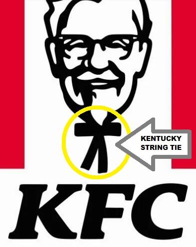
KFC on the other hand uses a huge white head on a tiny body. Again I believe this is. a racist attempt to cause division. The huge head suggests intellectual superiority while the tiny body represents the shrinking number of whites who do physical labour. In essence it says we work with our minds not our bodies.
KFC on the other hand uses a huge white head on a tiny body. Again I believe this is. a racist attempt to cause division. The huge head suggests intellectual superiority while the tiny body represents the shrinking number of whites who do physical labour. In essence it says we work with our minds not our bodies.
Big head on a tiny body is racist

BBC is racist

Both are racist
Select gender and age to cast your vote: