 Girl's Behavior
  Guy's Behavior
  Flirting
  Dating
  Relationships
  Fashion & Beauty
  Health & Fitness
  Marriage & Weddings
  Shopping & Gifts
  Technology & Internet
  Break Up & Divorce
  Education & Career
  Entertainment & Arts
  Family & Friends
  Food & Beverage
  Hobbies & Leisure
  Other
Other  Religion & Spirituality
  Society & Politics
  Sports
  Travel
  Trending & News
Hello GAG Community!!!!
We are making the first of a few changes to tidy some things up with the layout of GAG on both mobile and desktop.
New Changes for Mobile Devices:
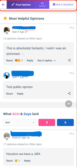
You will now be able to see the "Post Opinion" and "Ask Question Boxes" at the top of your screen on mobile. When you click on "post opinion", it will scroll to the opinion box and after clicking the ask question box, you will be redirected to the ask question page.
New Changes for Desktop Devices:

You will notice a "Post Opinion Box" near the top of your screen. If you click on it, it will take you to the "Opinion Box," down below.


Most Helpful Opinions