 Girl's Behavior
  Guy's Behavior
  Flirting
  Dating
  Relationships
  Fashion & Beauty
  Health & Fitness
  Marriage & Weddings
  Shopping & Gifts
  Technology & Internet
  Break Up & Divorce
  Education & Career
  Entertainment & Arts
  Family & Friends
  Food & Beverage
  Hobbies & Leisure
  Other
Other  Religion & Spirituality
  Society & Politics
  Sports
  Travel
  Trending & News

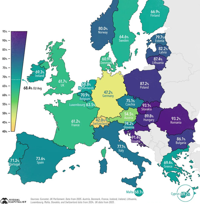
It's Monday, time for another map question...
This map shows countries of Europe with a percentage shown for each.
What do you think this percentage represents?
Answer will be given in a few days... Wednesday.
Updates
5 mo
This map shows home ownership. Within each country, how much of the population owns their own homes versus renting or leasing.
Congratulations to those who got this right.
Congratulations to those who got this right.