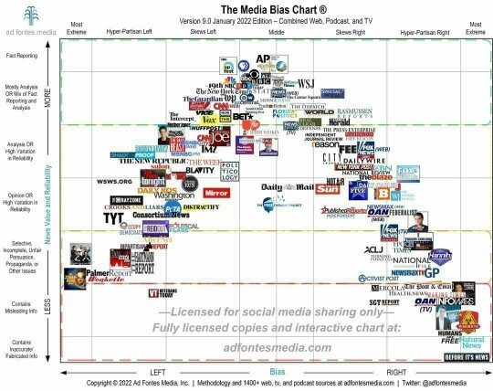
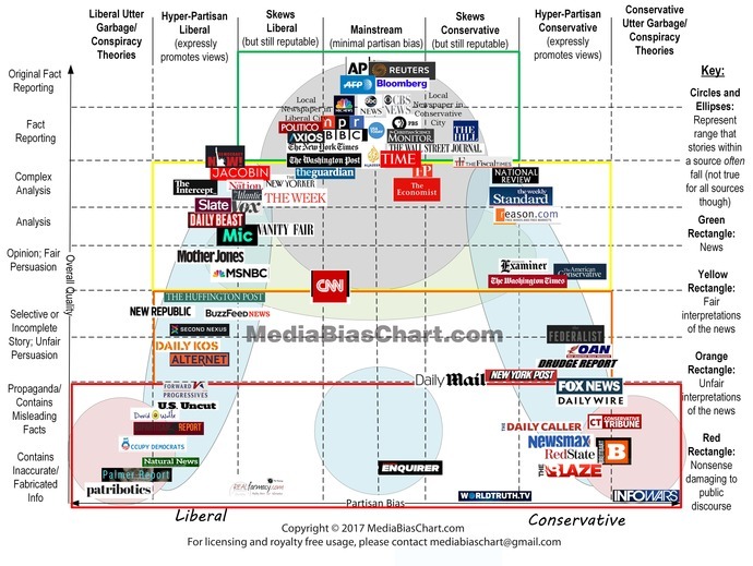
We all know different news organizations lean left or right and many are of questionable honesty. But this graph clearly shows that the right produces far more fake news than the left. Several dip well into makebelieve land. Given it's the right who always shout "fake news" at everything isn't that a little hypocritical? Or is the graph fake news? Opinions please.
Does this graph prove the rightwing media produces the most fake news?
The sad part about all the fake news is all the fake news casters the fake news companies they all have their hand in the cookie jar someplace remember way back when when you go to college you get your degree you go to work for a company and you would do whatever it took to get the hottest story. Go to any country to get the hottest story you do anything it took to get your name recognized as the hottest journalists around you'll see that anymore at all if you have fake news you have fake news companies you have fake news people It is a shame that people with degrade themselves that bad to put out fake news Once Trump got into office I quit watching TV far as I was concerned the whole fucking thing was fake but we have to live in it live in that world nothing but lies Liars cheaters we have the media that creates chaos because of their lies it's all scare tactics I used to watch one channel because they gave the best weather report he can't even get the weather report right anymore If you listen to the right wing in the left bring to their words very carefully they want the exact same thing they just use different worry that's all if they can keep us confused they're doing their job if they put up the front right is against left I keep is confused did they get to stay in business another year it's all bulshit. Far as I'm concerned with you fire them all starting at the top and work our way down
2
0 Reply
Most Helpful Opinions
Anonymous
(25-29)
+1 y
The Graph itself is made by someone with ideological biases from a left-wing perspective; the political centre is WSJ, but due to the incorrect vertical positioning it is a mostly unreliable source from an objective standpoint. As a result I would say no.
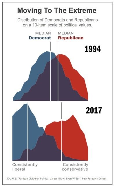
I am not American, so this holds no bearing on me, but this ideological divide you have appears to be only widening - and your Right are mostly standing still.
Pew Research Centre Study
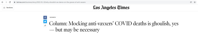
Just read the URL below. That was their original headline, glorifying the death of your fellow Americans? It's worse when you realise those vaccine hesitant include pregnant women and ethnic/religious minorities. They've changed that headline 3 times at least.
By what methodology was this "data" determined? What is the bias of the organization compiling the information? Can this result be replicated by another unrelated organization?
The graph is misleading. Though it shows more organizations on the right, if you were to look at readership/viewership/listenership numbers, there are more people on the left than on the right.
This graph is proof that anyone can use figures, pictures, or graphs to "prove" whatever they want.
One could also legitimately argue where each organization is placed on the chart. For example, CNN is shown in the More Reliable area, yet some CNN stories are totally liberal biased with questionable reliability.
Well put. I was thinking along the same lines. You could have one organization that has more resources, putting out 100X the amount of "news" of 10 other organizations combined (think major network vs. a bunch of small town newspapers or bloggers). So having pictures of the number of organizations doesn't tell us about which side PRODUCES the most, and it might (probably) not even tell us which side has the most organizations.
It's hard for me to say the graph isn't fake news itself. One of the biggest issues with media on both sides is how insanely biased it is. So it's a constant race to see who can be more biased then the other. Though no one admit it despite how insanely obvious it is. Also biased does very much encourage one to blow things out of proportion and potentially lie about the side a argument a person is against. So the sheer amount of biased on both sides inspires fake news on both sides. Because of that the graph could have come from site or organization that is biased against the right and with some digger you will see a matching graph that is the reverse. Due to that I'd call BS on both.
And this is produced by whom belonging to what organization, for what purpose and peer reviewed by what people? Pulling up any chart and taking it for fact isn't wise especially not with something as immensily politicized as media and whether or not they produce "fake news" fake according to whom, what parameters were used in analyzing that? And too many people do that and then instantly declare it fact simply because they want to believe what is suggested. I'm pretty sure it isn't hard to find a chart claiming the opposite.
Even if we accept the methodology to be perfectly correct in classifying fake news and such, this graph only informs about the sample this site has. It does not inform about the “true” distribution, whatever that may be
I've seen that graph, and used it, many times because I think it's quite accurate. It doesn't show radio media, which is completely ruled by right wing broadcasts. I think both sides omit and package the information they want out there, but I think the right-wing is far more diligent and adept at it. Also, they are more brazen when it comes to flat out lies made up out of whole cloth, with no shreds of truth in it.
I can't trust information from any source until I check it out from a variety of sources. I think it's more likely I'll get an accurate statement that's mostly true from National Public Radio, than from Fox or CNN.
No. The right wing certainly does put out more BS, and a thinking person can tell that just by watching the different networks. But already you are seeing opinions that prove some people only believe what they want, regardless of how far out the bullshit is.
All politicians are crooks. I also feel that way about big business in our government. All the fake news meant to divide people who basically want the same things. The elites are elites no matter what side of the aisle they spend their money on. Democrats are not recognizable as democrats any more gone to far left. I think that will change soon as they will see it’s in their best interest to weed the crazies of their party. Then they’ll just be normally corrupt like the republicans. Both sides seek to enslave us to their rhetoric. Maybe think what’s best for us all instead of the few. I’m a libertarian. I believe in your right to live and pursue happiness as you see fit for yourself. Even if you want to wear a shirt on your butt and pants on your noggin I figger to each their own as long as it don’t hurt me or mine. With that I’m out y’all have a great day. Your life is what you make it.
This is just liberal cope. You 'tards love imagining yourselves as a kind of protagonist heroes who will save the world with the "empathy" and "niceness" you feign...
But in reality, liberals and conservatives are the same 💩 with different names.
The world needs to be saved from y'all!
The story that "Iraq had WMDs," "Russians interfered in the US 2016 election and elected Trump," and "Russia paid Talibans to kill Americans" were by far the nastiest examples of fake news in the history of world's jornalism.
Why would anyone watch any cable "news" or read "news" from online sites? If you really want to know what's going on before things become twisted, cherry-picked, and/or buried by the "national" media and/or online digital shitholes, watch local news broadcasts. There's plenty of local news outlets that put their coverage, stories, and content on YouTube. I also watch John Stossel's content. He's excellent and does a great job showing all sides and angles of an issue, and allows the viewer to use their own critical thinking and common sense.
@Physics-Man Agreed. Unlike other "journalists", he's not afraid to present multiple positions on many given issues, even if he personally disagrees with someone's opinions or conclusions. I used to watch him on WABC as a teenager with my Dad on Friday evenings.
No, this graph is absolutely false. This graph is exactly what they want you to believe. The left owns almost all the media. I've spent time watching lots of different news channels and researching, any channels that say Trump said to drink bleach or call jan 6th an inserrection will instantly make you dumber. And this isn't an opinion. You have nothing to gain from these channels, unless you want to hear the next false accusations about Trump or hear people insulting Republicans. You won't learn anything about what's really going on. And oan is a good channel. All this graph is showing you is who gave the most money to them to make a graph and what they want you to think
It would prove that the sampling this particular organization has done has shown there to be more right-wing fake news websites. Note that this does not necessarily inform about the “true” distribution, only the sample distribution this site has. So no, this graph doesn’t prove that.
Showing a chart of something and implying it's unbiased and neutral and thus, you should automatically believe it, isn't how facts and reality work. Especially when said chart doesn't have CNN at the very bottom when it comes to factual reporting. (CNN even has its own Wikipedia page on how many times its lied; putting it on the main page was too much).
Yeah. There's no reason anyone would ever vote for tax cuts for the rich. And that's the only thing conservatives are after. So they have to come up with fantasies. And, since they are the rich, they have the resources they need to pay thousands of podcasters (or whatever) to make entire full time jobs out of figuring the best lie to tell people to get them to vote for them tax cuts. The lies can reflect the truth closely or be completely batshit. It doesn't matter as long as it works.
Graph is fake news. Start figuring out for yourself and take your time to calm your emotions before making a decision. 90% of media is left wing and they repeat the same words everyday. Racist, misogyny, bigot, etc. You say that enough times to people who want to believe it, they will eventually believe it. It’s called The Big Lie.
If the graph was created by an unbiased source on the basis of pure facts and nothing else, then it would reflect reality. However, if the individual is biased in any way, the validity of said graph would be a bit questionable, at the very least.
Not at all. All you need to do is ask who made this graph and what's the track record.
Their trackrecord is calling the lab theory a completely debunked racist conspiracy theory that's causing anti-asian violence, but saying the virus came from the disgusting chinese with their disgusting habits of eating bush meat on very unhygienic conditions, Xi should just put every chinese in a concentration camp until all of them die, that's not racise.
this graph does not show Viewers for any given Media... "humans are free? Natural News? Before it's news? OAN? who are these people? they have almost "No one" watching so, its very misleading. If your going to Include "Blogs" I am sure we can find thousands of Radical left wing-nuts
The graph is inaccurate and it counts small independent right leaning news the same as large network left leaning news sources. That alone shows that it is intentionally misleading and "fake."
Well over the past 5 years what we have observed is that a lot of what was called right wing conspiracy theories turned out to be true, and a lot of left wing "facts" have turned out to be false.
Fox is there twice and it's supposedly better than Newsmax?
Where is Dave Rubin? Larry Elder? The Epoch Times or Russell Brand?
Candace? Prager U? Bill Maher? Ted Cruz and Rand Paul both put out their own content. Desantis does a ton of press conference.
Joe Rogan? He has like 10 times the viewers CNN does these days.
Honestly, Forbes YouTube channel is the best place for fair and accurate conservative content. They don't comment. They just roll the tape of the politicians talking without any edits whatsoever.
The graph is obviously out dated to say the least. Mayby from 10-15 years ago. Bill Oriley wasn't so great, people used to trust PBS, NPR and the AP before we knew better... But now Fox hosts Candace, Mike Roe, John Stewart, and Tucker Carlson (formerly on CNN/PBS/MSNBC) they do exclusive interviews with the candidates, even grill republicans like Ted Cruz on air.
Times have changed. If this ever was accurate it was a very long time ago.
But let's be honest, the real issue is that most of those sources have gone with CNN and lost 90% of their audience in the last 5 years.
Only the dumbest 10% of CNN's former viewers still even consider them a news Network. So why are we even talking about this same biased graph I saw where I was a child?
Graph is fake news. Cnn that covered the trump russia hoax for about a year when they knew it was a nothing burger... smh thats not fact reporting. Many other serious issues on this chart. Its basically a junk graph.
2
0 Reply
Anonymous
(30-35)
+1 y
Who is deciding here what’s truthful and what’s not? Who are they paid by?
It's difficult to make out because it's so small (clicking on it doesn't enlarge), but from what I can see I would have to say no. It looks to me like an even spread, a nice bell-curve, with the more moderate outlets being at top-centre.
What exactly "IS" the Right Wing, and how does the West Wing fit into all of it?
0
0 Reply
Anonymous
(36-45)
+1 y
The graph is relative to the Overton window of 2020 or whenever this graph was produced. It’s laughable that, on this graph, CNN and The New York Times are “slight left” because they gave >90% negative coverage of the last Republican president.
Considering that is from an opinion piece, and not factual.. No.
0
0 Reply
Anonymous
(30-35)
+1 y
One would have to assume the creator is absent of bias, which I doubt given that at a glance I can see media entities on the left that are far more left and far more biased than represented here.
 Girl's Behavior
  Guy's Behavior
  Flirting
  Dating
  Relationships
  Fashion & Beauty
  Health & Fitness
  Marriage & Weddings
  Shopping & Gifts
  Technology & Internet
  Break Up & Divorce
  Education & Career
  Entertainment & Arts
  Family & Friends
  Food & Beverage
  Hobbies & Leisure
  Other
Other  Religion & Spirituality
  Society & Politics
  Sports
  Travel
  Trending & News